
Reading Time : 1 Mins
10 Best Bank Website Designs To Inspire You In 2024
Digital is changing the banking industry’s landscape, raising customer expectations for convenience and speed.
Today’s banking customer is fast moving towards the self-service model and manages all their banking transactions either on mobile, tablet, or desktop.
And the first thing that your customers look at when choosing their banking service provider is your website. Customers want their banks to provide a frictionless experience by being:
- Highly contextual and relevant
- Responsive and user-friendly design across platforms
- Personalization of products and services
- High level of website security
- Brand consistency and overall functionality
Although many banking websites have been stagnant for years, on the other hand, many others are progressing ahead with new website design using exceptional functionality that engages users, increases brand awareness, and convert prospective clients. (Check out the “5 Actionable Usability Testing Tips For Your Website” to ace your customer experience.)
Below is a list (in no particular order) of 10 best bank website designs you must be inspired from in 2024 and beyond.
Let’s dive right in.
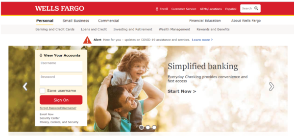
1. WELLS FARGO
Wells Fargo is a diversified, community-based financial services company. Wells Fargo’s website design is super responsive and easy to navigate across devices. The website design is simple with attractive images, which is well laid out to address all customer personas.
Even though Well Fargo is one of the largest banks, the “Small Business” section’s inclusion on the home page clearly communicates the messaging to the relevant customers to gain trust.
Overall, the website is an extremely intuitive, user-friendly design with prominent CTA’s for all the banking services (from opening a savings account to planning your retirement), promises to be a trusted partner for customers and prospective members.
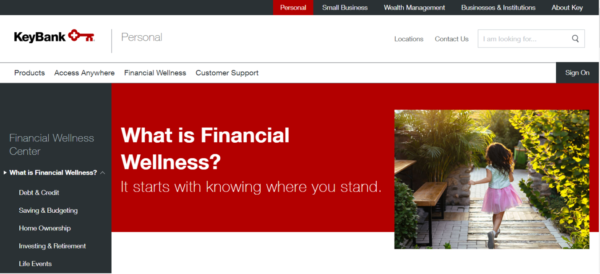
2. KeyBanK
KeyBank, a KeyCorp subsidiary, is a Cleveland, Ohio-based financial institution and a regional bank. Their branding is simple yet effective: a key for their logo that appears on their homepage and every subpage, and a cohesive, bold color scheme of red, gray, and white keeps the customers on their toes. The sleek sign-on button on the right side is unique in design, which also takes up less space.
The CTA – Come on in, on the homepage, provides a warm welcome to visitors and feels like a key to a doorway. Once the visitor clicks the CTA, they will get an abstract of what the bank offers with personalized content and videos.
After choosing the relevant sub-tab, the sidebar visible on the website’s right-side features everything from the login button to the rates is one of our favorite design elements.
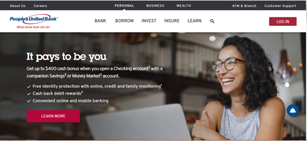
3. People’s United Bank
People’s United Bank is a subsidiary of People’s United Financial, Inc., a diversified, community-focused financial services company. Again, People’s United Bank’s web design is simple and clean with a white overlay for a tunnel vision on the banks offering.
The website offers an option to compare between accounts, which allows the customer to personalize his banking experience. The bank website also shows pop-ups after the first few minutes, which is placed subtly and does not cover the entire screen.
Simultaneously, some information is highlighted with a blue background with red CTAs (call to action) to stand out without overwhelming customers.
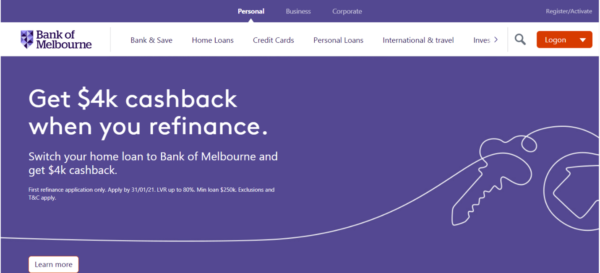
4. Bank of Melbourne
Bank of Melbourne is a financial institution operating in Victoria, Australia. The bank’s website is a shining example of a simple and clean scrolling design that looks good on any device. Every small detailing on this banking website is very well designed by the user experience team.
The bank design doesn’t swamp with option overload. Instead, the website ribbon is designed as a carousel to show the most relevant product and services offerings. At the bottom of the home page, the bank has listed down its home loan interest rates, which helps visitors compare it with other banks.
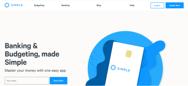
5. SIMPLE
Simple is an American neobank (also known as an online bank, internet-only bank, virtual bank or digital bank) based in Portland, Oregon. Simple, as the name goes, has a simple layout and navigation that won’t confuse users meanwhile stands out in the market.
Simple Bank, being a neobank, provides educational content on its website, which the customer can read any time without reaching out to support staff. The mission of Simple Bank is to provide customers a very non-traditional banking experience.
The website also uses a lot of white spaces with very little text on its pages to catch the users’ attention right from the get-go.
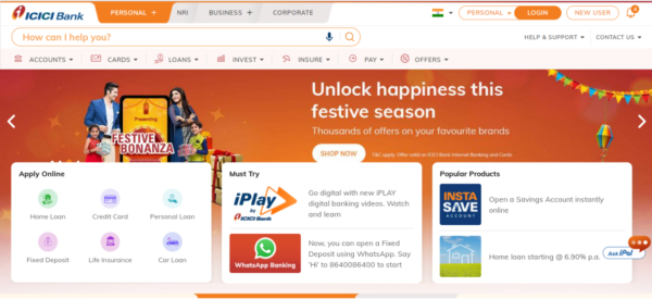
6. ICICI Bank
ICICI Bank Limited is an Indian multinational banking and financial services company. ICICI Bank website feels like a financial supermarket with many vibrant colors on the website to give a fun, refreshing experience to the visitor.
The inclusion of an online chat AskiPal feels like Apple’s Siri. Along with that, ICICI Bank provides WhatsApp Banking and iPlay Digital Banking solutions considering the modern age customers. The homepage carrying its quick tour videos is a good example of how they realize the customer needs.
The notification pop-ups on the top right corner of the website communicate personalized offers for first-time visitors and friendly help & support assistance, which are easy to reach out to.
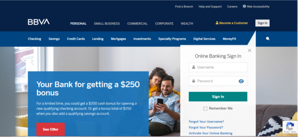
7. BBVA
BBVA USA is a bank holding company headquartered in Birmingham, Alabama. BBVA s bank offers a wide array of financial services & products for a varied audience, making it challenging to maintain clean and easy navigation.
However, on the contrary, BBVA’s website offers a clear visual hierarchy that funnels users into the website’s appropriate section, allowing them to find the information they need without much of a hurdle. Also, the use of blues and overlays adds contrast and gives a clear message of their branding.
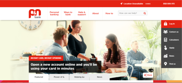
8. P&N Bank
P&N Bank is a division of Police & Nurses Limited and an Australian owned bank managed in Western Australia. P&N Bank is another excellent example of a beautiful website design.
P&N website does a great job by combining the red and white brand colors with custom background on the homepage, which clearly positions their messaging for existing and potential customers.
The sidebar visible on the right side of the homepage, which features everything from the login button to the rates, is one of our favorite design elements.
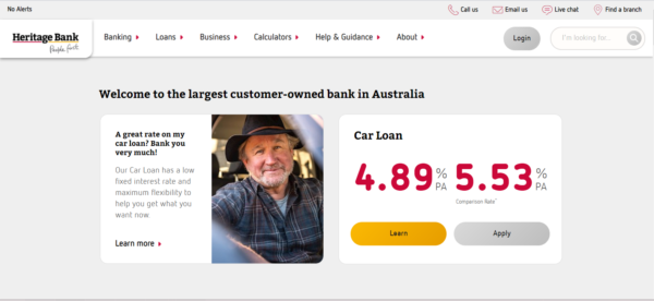
9. Heritage Bank
Heritage Bank Limited is Australia’s largest . . Heritage Bank’s website design boldly displays its competitive fixed interest rates, which helps gain loyalty and transparency among customers.
Scrolling further down the page, displays the awards and CTAs (call to action) that can help take a right action and to find a branch for customers to get in touch. This relevant content placement with visitor intent on mind can surely help improve the conversion rates.
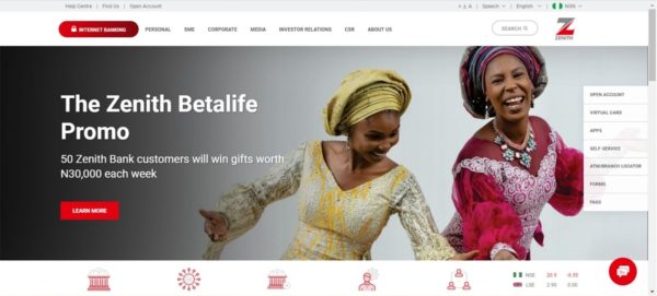
10. Zenith Bank
Zenith Bank is a global financial services provider with a presence in Nigeria, the United Kingdom, Ghana, Sierra Leone, and Gambia. Zenith Bank website is on our list for many reasons. The first and foremost is the professional looking website design that makes the bank look more authoritative.
Adding, the custom background, animation, and consistency are some other elements that draw even more eyeballs. Again, the standstill sidebar addition helps visitors to navigate across tabs swiftly.
What Makes These Websites Effective?
Each of the websites showcased in our list of top 10 banking websites is doing an excellent job of building trust, providing information, and guiding the visitors with a frictionless experience.
Apart from the principles mentioned above, let us look at some of the essential design elements that you should consider for your website to stand out.
- Position your branding aesthetics throughout your website
- Website navigation should be consistent
- Tabs should be clearly labeled
- Use drop-down menus for a streamlined navigation experience
- Avoid too many links in your menus
- Clear and concise brand messaging
- Omnichannel website friendliness
Customer experience has reached to paramount importance in recent times. Moreover, customers compare their digital banking experiences with other industries now. It becomes even more critical with newer Fintech (or Financial Technology) companies disrupting the banking industry.
Note: Here are the best customer experience strategies for banks that can help you design a unique user-friendly website. Do have a read.
Final Thoughts
We all know that first impressions are vital for any client relationship, but this is even more true online since users rate the website’s visual appeal and form brand opinions within 0.05 seconds.
Your website is your company’s face online, and it’s the first impression that your potential customers will have of your bank. With periodic audits and consistent updates to your website, your business can increase brand consistency, reduce customer churn, and convert prospective clients with personalization.
At Zuci Systems, we develop great bank websites with our frictionless design thinking to make your customer experience your strongest competitive advantage. Get Your UI/UX Audit Report Today!

I write about fintech, data, and everything around it | Assistant Marketing Manager @ Zuci Systems.
Share This Blog, Choose Your Platform!
Related Posts
 for Banks & Credit Unions Monitor and Manage RPA Bots with Ease")


")


")
