Reading Time : 1 Mins
Top 10 Data Visualization Techniques You Should Know
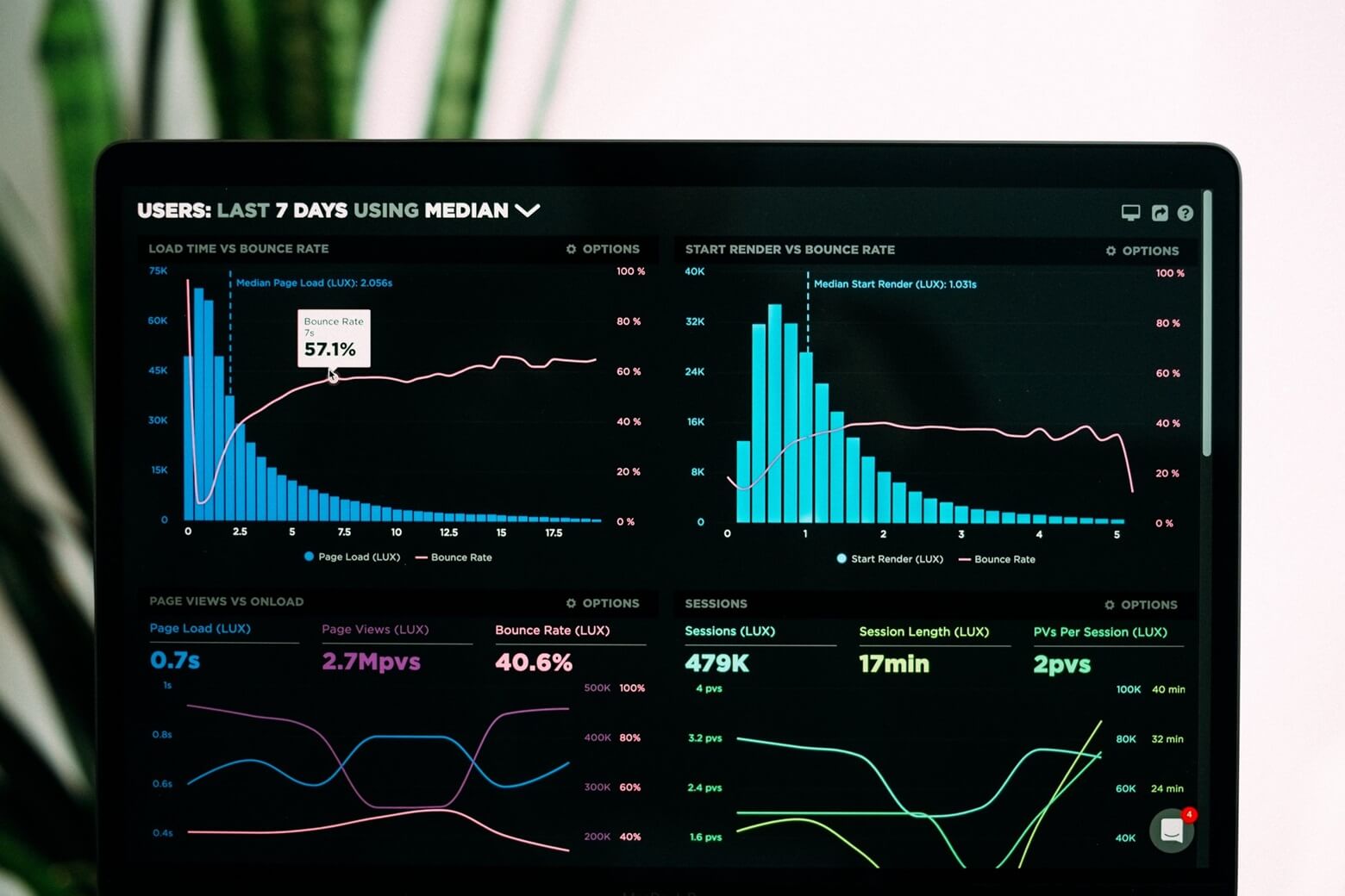
The graphical representation of information and data with the help of visual elements such as graphs, maps, charts, etc., is called data visualization. Businesses these days have access to a lot of data. They can use them to understand trends, predict patterns, and see if there are any outliers that require their immediate attention.
We are in the age of big data, and data visualization is a tool that many businesses cannot afford to ignore. Data visualization techniques help you tell stories that eventually make you understand your customers on a deeper level.
Let us look at the Top 10 data visualization techniques that you need to know:
Data Visualization Technique 1 – Histogram:
It is a graphical representation of information that uses bars of various heights, and each of these bars group numbers into ranges, and is also called a bar chart. A taller bar implies that a lot more data falls in that range.
- The histogram shows the shape and spread of continual data
- It shows the exact portrayal of mathematical data and it relates with just a single variable
- This technique makes it easier to identify different types of data
- You can determine statistical information with the help of the data presented in the histogram
Data Visualization Technique 2 – Heatmaps:
It is a pretty unique way of representing data as it uses colors to mark different values. Thanks to the difference in color, the viewers will be able to grasp the trends more accurately. Heatmaps are great for visualizing correlation tables and for visualizing the missing values in the data.
- Helps visualize the volume of locations/events with a dataset
- They provide a great way of understanding how your users are behaving on your website or mobile app
- It even enables analysts to segment and filters the data which helps you see how different types of users are engaging on a particular landing page
Data Visualization Technique 3 – Charts:
One of the most popular types of data visualization techniques, there are several varieties of charts. We have already discussed bar charts aka histograms. The other types are line charts, pie charts, scatter charts, and bubble charts.
Line charts are used to plot the relationship of dependence of one variable on another variable. If you want to show continuously changing data over a long period, line charts are great.
Pie charts are circular statistical graphs where the pieces are used to denote a numerical ratio. The arc size of each piece is equal to the amount it indicates.
Scatter charts are two-dimensional plots denoting the joint variation of two different data elements.
Bubble charts are scattered charts, except that the data points are replaced with bubbles.
Data Visualization Technique 4- Word Cloud:
A word cloud is used to denote the frequency of the words that are used in a collection of text with its general size in the form of a cloud. This technique is usually employed on unstructured data to show how frequently a particular word occurs.
- The bigger and bolder the word appears in the word cloud, the more often it is mentioned within a given text
- It is a cheaper option to analyze text from online surveys
- Word clouds are great to analyze answers for open-ended questions
Also Read: 15 Best Tools for Business Intelligence in 2024
Data Visualization Technique 5 – Gauge charts:
Also called speedometer charts or dial charts, they use needles to show information as if you were reading them on a dial. When you use a gauge chart, the value for each needle is read against the colored data range or chart axis.
- Used exclusively in executive dashboard reports to show KPIs
- They are helpful for the comparison of a small number of variables
- Types of gauge charts- Speedometer, rating meter, quarter gauge, linear scale, cylinder fill, LED gauge, bulb gauge and thermometer gauge
- Easy for non-technical viewers to take insights from it
Data Visualization Technique 6 – Wedge stacked graphs:
They are a type of visualization technique that displays hierarchical data in a radial system. Wedge stacked graphs are great for illustrating multi-level frequency data.
- This graph type can depict negative values
- The wedge graph type is not affected by the object size and number of side indicators
- If you choose wedges on the stacked graph, then the graph type shifts to walls that are stacked
Data Visualization Technique 7 – Streamgraphs:
It is a type of stacked area graph which is displaced around a central axis that gives it a flowy and organic shape or looks like streams. You should look for the peaks and the shallow periods over a period of time to understand the patterns. Check out the different colors which can be used to identify patterns or outliers.
- They are ideal for displaying high-volume datasets
- It can also be used to visually represent the volatility for a large set of data and how it changes over a period of time
- It should be used for viewers who do not want to spend a lot of time trying to decipher the graph
Data Visualization Technique 8 – Dendrograms:
It is a branching diagram that represents the relationship of similarity among a group of entities. The playoff tournament diagram, which is used commonly in clustering and cluster analysis, is the most common example of a dendrogram.
- They are used to show the hierarchical relationship which exists between objects
- It provides one of the best ways to allocate objects to clusters
- Dendrograms are best suited when you only have a small number of findings
Data Visualization Technique 9 – Box plots:
They give a visual outline of information through quartiles. Also called a box and whisker plot, they display the five-number summary of a set of data.
- Often used in explanatory data analysis
- It is used to show the shape of the distribution, central value, and variability
- Boxplots work best when the sample size is at least 20
Data Visualization Technique 10 – Treemaps:
It displays hierarchical data as a set of nested rectangles. Treemaps are an alternative way of visualizing the hierarchical structure of a tree diagram while representing quantities for each category through area size.
- Treemaps were developed as a way of visualizing a vast file directory on a computer
- They are a compact option for displaying hierarchies
- To compare proportions between categories through their area size, treemaps are the best
Data Visualization Importance and Benefits
Enterprises produce vast volumes of data generated from various sources, leading to challenges in deriving meaningful insights. Data visualization techniques help resolve these challenges. The below mentioned are some of the data visualization benefits:
- Decision Making: Data visualization provides a clear, intuitive way to interpret complex datasets, enabling stakeholders to make data-driven decisions with confidence.
- Identifying Opportunities and Risks: Visualization techniques and tools help in identifying trends, patterns, and outliers in data, enabling proactive risk management and capitalizing on new opportunities.
- Operational Efficiency: Inefficiencies in operations can hinder enterprise performance. Visualization of operational data allows enterprises to identify bottlenecks, streamline processes, and optimize resource allocation, leading to improved efficiency and cost savings.
- Customer Insights: Understanding customer behavior and preferences is crucial for enterprises to stay competitive. Data visualization enables enterprises to analyze customer data comprehensively, uncover insights into buying patterns, preferences, and sentiment, thus enhancing customer experience and loyalty.
- Strategic Planning: Enterprises require a clear strategic direction to achieve their long-term goals. Visualization of strategic data, such as market trends, competitor analysis, and performance metrics, facilitates strategic planning and enables agile decision-making to adapt to changing market dynamics.
Data Visualization Best Practices
Enterprises often struggle with creating visualizations that effectively communicate insights without overwhelming the audience or leading to misinterpretation. To address these challenges, adhering to data visualization best practices becomes essential. By focusing on simplicity, consistency, and user-centric design principles, enterprises can create visualizations that resonate with their audience and drive meaningful outcomes. Below are some of the data visualization best practices for enterprises.
- Customization for Stakeholders: Enterprise comprise many decision-makers with varying levels of expertise and interests. Hence, it is ideal to customize visualizations to cater to the specific needs and preferences of different stakeholders, ensuring clarity and relevance.
- Streamlined Design: Enterprises deal with vast amounts of data, and cluttered visualizations can overwhelm viewers. Keeping visualizations clean and streamlined will help avoid information overload.
- Contextual Understanding: Enterprises need to contextualize data within the broader business landscape. By providing adequate context and explanations alongside visualizations, stakeholders can understand the significance of the data and its implications for the enterprise.
- Consistent Branding: Enterprises maintain brand identity across all communications. Hence, applying consistent branding elements such as color schemes, fonts, and logos will reinforce brand identity and foster recognition.
By implementing these data visualization best practices, enterprises can create visualizations that effectively communicate insights, foster collaboration, and drive informed decision-making across the organization.
Tips for Creating Effective Visualizations
Enterprises rely on data-driven insights to make informed decisions that drive growth and innovation. However, creating visualizations that effectively convey these insights is essential for facilitating the decision-making process. Here are some tips for organizations to create compelling visualizations that empower stakeholders to make informed decisions:
- Identify the key insights that are crucial for informing decision-making processes. Direct your visualization efforts towards highlighting these decision-relevant insights prominently.
- Ensure that your visualizations present actionable insights that can directly influence strategic decisions within the organization. Focus on visualizing data points that have a significant impact on future courses of action.
- Provide context around the data being visualized to help stakeholders understand the significance of the insights presented. Incorporate relevant background information, industry benchmarks, or historical trends to enrich the interpretation of the data.
- Enable stakeholders to conduct comparative analysis effortlessly by designing visualizations that allow for easy comparison between different data sets, time periods, or segments. Use side-by-side visualizations or interactive features to facilitate this process.
- Encourage stakeholders to explore the data further by incorporating interactive elements into your visualizations. Allow users to drill down into specific data points, filter information based on their criteria, or adjust parameters to gain deeper insights.
- Prioritize clarity and accuracy in your visualizations to prevent misinterpretation or confusion among stakeholders. Clearly label data points, provide accurate annotations, and avoid cluttering visualizations with unnecessary elements.
- Collaborate with key stakeholders throughout the visualization creation process to gather feedback and insights. Incorporate their input to refine visualizations and ensure they effectively meet the organization’s decision-making needs.
How to Choose the Right Data Visualization Technique?
Informed decision-making lies at the heart of organizational success, and choosing the right data visualization technique is crucial in this process. Organizations must carefully assess their data and analytical needs to choose visualization techniques and tools that provide clear and actionable insights. Here’s how organizations can choose the right data visualization technique to support informed decision-making:
- Organizations should start by clarifying the objectives of the decision-making process. Determine the specific insights needed to inform these decisions and identify the data points that will contribute most effectively to achieving these objectives.
- Take into account the context in which decisions will be made. Consider factors such as the urgency of decision-making, the level of complexity involved, and the preferences of decision-makers regarding visualization styles and formats.
- Assess the complexity and dimensionality of the data to be visualized. Determine whether the data is categorical, numerical, or temporal in nature, and choose visualization techniques that are well-suited to representing these different types of data effectively.
- Prioritize clarity and interpretability in your visualization choices. Select techniques that make it easy for decision-makers to extract insights quickly and accurately, avoiding overly complex or cluttered visualizations that may obscure key information.
- Choose visualization techniques that facilitate comparative analysis, allowing decision-makers to compare different datasets and trends.
- Continuously iterate and refine your visualization choices based on feedback from decision-makers and stakeholders.
Conclusion:
Creating effective data visualization is more than just about choosing the right kind of visualization technique. There are a lot of things that you need to have in place before presenting your data. The first step is to understand your audience and also ensure that there are no unnecessary distractions while viewing the data. Data plays a pivotal role in organizations these days, and you cannot afford to not employ them.
If you are looking for help with data visualization solutions, get in touch with the experts at Zuci who can get things started for you.

Chatty & gregarious, you can find her with her baby plants when not with her marketing team.
Share This Blog, Choose Your Platform!
Related Posts


